Monday, February 28, 2011

Temperature Painting

Here's a portrait done for our Head Painting class. The current technique is to use only burnt umber and titanium white, using both pick-out and opaque techniques. The result, if done correctly, is a temperature painting where the lights are all cool and the shadows are all warm. I believe it could technically be deemed a grisaille technique.

Essentially the way it works is that you have two ways to get value; burnt umber is your darkest value, and thinning it will give you warm, transparent lighter values, and adding titanium white will give you cool, opaque lighter values. Using the two, you can make a separation of temperature between your lights and your darks, which is a powerful compositional tool and an essential part of color theory. I'm really glad we're learning to use oil paint this simply, beginning with only value, now value and temperature, and we're going to be gradually working in color; I'd definitely recommend this route if you want to get in to traditional media.

Sunday, February 27, 2011

Using Painter's Impasto

Here's part five of five in the series on getting natural brush strokes in Painter! This section will go over Painter's impasto feature, which is a quick way to get some surface variation in your piece. Impasto is a traditional term, it refers to brush strokes that are so thick they actually raise off the surface of the canvas and have 3D form, rather than just sitting flatly on top. This is present in a lot of traditional paintings, often a few strokes in the lights will be made impasto to make them catch the light and pop off the page, and it was a favorite technique of the impressionists.

Obviously in digital there's no way to get a blob of pixels to raise off the surface of your screen, but you can at least capture some of the effect with Painter's impasto. But a note of warning, this effect can be very easily overdone and look like a gimmicky trick that distracts from your piece; if you use it, use it with extreme subtlety. Much like texture, it should be used as an accent and should not draw attention to itself, especially because real impasto has such organic shapes that the calculated strokes of Painter will look unnatural if it catches your attention.

With that said, let's get down to business. Painter has a number of default impasto brushes which you can use, or you can make your own simply by opening a suitable brush in the brush creator, going under the impasto tab and changing the Draw To option to either Depth or Color and Depth. Depth will simply add impasto and not actually change any of the pixels that are on the canvas, Color and Depth will lay down new paint as well as add impasto to the surface. For my impasto brush, I started with the Wet Oily Brush in the Arists' Oils category, changed the settings so it would not fade out so quickly, and set it to Color and Depth with a depth of 100%. Here's an example of what it looks like, using just one color:


The impasto feature will take the opacity of a stroke and apply depth to it; the more opaque an area is the more depth it has. It then lights the canvas and this depth catches the light, creating an impasto effect (As a side note, beware of the canvas lighting changing the values in your piece, go up to Canvas -> Surface Lighting to adjust your surface lighting and be sure it's similar to the values when there is no impasto).
Now, this effect is useful not only for creating thick looking strokes, but also for creating surface texture that layers over time. I can take that same image above and apply a brush that does not apply any depth and look what happens:


You can see that the striations from the impasto brush are left over even when I paint normal brush strokes over top of it, this effect adds a really nice variety to your markmaking and can make your strokes feel very traditional. Now, there's a danger to impasto that we must address, and that is the overexposed highlights and pixelated edges it often creates. When you use impasto brushes, their varying levels of depth can create these artifacts that look pretty hideous:


This is the reason why a lot of digital impasto just looks cheap, but it can easily be fixed with a little extra effort, and the end result can be very satisfying. Essentially what you need to do is create a brush that will blend out the strokes; I made mine out of the same captured dab I showed in yesterday's post, and set the impasto Color and Depth, depth method Uniform, Depth 50%, and expression set to Pressure. The captured dab Impasto isn't using the hard strokes that the Artists' Oils does so it can be used to blend out those artifacts, and though you could just use a captured dab for all your impasto effects I find that it can build up in weird ways and the Artists' Oils looks more subtle and appealing. A mix of the two works best in my opinion. Here's the same image with the artifacts gently blended out:


And here is the same image with no impasto effects:


As you can see, after pixelation issues have been solved, impasto can add a very paint-like quality to your strokes. This becomes very useful because you can use the impasto to define stroke direction and texture, and use regular brushes to handle most of the painting without the impasto getting overdone. Just be sure you clean up the artifacts after laying down the impasto, and you'll have some powerful effects on your hands!


So, to conclude this series, you now have a bunch of ways to make interesting, painterly brush strokes, but how do you apply it all? The secret is in combining all of them in to one to create a seemingly natural and effortless brush stroke; you can use paper textures to create surface variety, custom brushes to create natural strokes, and impasto to create direction and depth.


And that's it for this series! Hopefully it was useful, I'll try and get up a step-by-step up sometime to show this being used in an actual painting of some sort. Until then, happy painting!

Saturday, February 26, 2011

Painter Custom Brushes Pt. 2

Part four of of five in the series on getting natural brush strokes in Painter. This section will cover a simple way to add additional customization: captured dabs!

As stated in Part One, dabs are the shape of the brush that Painter repeats in succession to create a brush stroke, the same way Photoshop does. This is useful because you can essentially use any image you want to create a dab with, and therefore make any brush shape you want. This coupled with the settings in the brush creator gives you a ton of possibility in the variety of brushes you can make.

It's relatively simple to do, the first thing you'll need is a black and white image with the kind of stroke you want the brush to have. This image will function similarly to paper textures; black will paint at the full opacity of your brush, midtones will paint a moderate opacity, and white will be totally transparent. Also remember that to make a brush stroke Painter will layer this image one in front of the other, so bear in mind that there will be some overlap and not all the texture will show through.

To demonstrate, I'll make a fairly realistic paintbrush stroke. The previous part showed the creation of a nice paint-like brush that blends like wet in to wet oil, but the stroke is just an oval, I think it would be nice if the stroke were more interesting so I'm going to edit that one. You could make an entirely new brush if you wanted to; but note that some kinds of brushes (Arists' Oils for instance) have special settings and behaviors and therefore cannot use captured dabs. As always, it will just take some experimenting to find what brushes will work and what won't.

Now, here's the image I'm going to use for my captured dab:


This is going to make a nice dab because it has some texture that will show up if I just tap the brush, and there's some texture near the edges that will create the ragged look of a real brush. Your image should be relatively high contrast and probably shouldn't be larger than 500x500 pixels.


Open up your image in painter, then press Ctrl (Command) + A to select all, or go to Select -> All. A dotted line should appear around the whole image, showing that it is selected. Now go up to the arrow at the top right of your brush selector where you save variants, and this time click Capture Dab.


This image should now be in place as your captured dab. Open up your brush creator with Ctrl (Command) + B or Window -> Show Brush Creator and under the General tab set your Dab Type to Captured (It may be set there automatically). After that, make some strokes in the brush testing area to see your dab in action!


You'll probably want to adjust some of your settings to take advantage of this more complex stroke to get it looking even more dynamic. I like the way my dab is looking, but I want it to react more to the stroke of the pen like a real brush would. I'm not going to go in-depth about the settings I change because most of that is covered in part one; but the basics of what I changed was that I made the angle change based on direction, reduced the spacing between each stamp of the dab to make it smoother, and changed its method subcategory to a grainy one so it will use my selected paper textures. As said in part one, just experiment with the different settings to get the kind of brush you're looking for, this whole thing is about creating your own unique brushes, so don't be formulaic! Look for happy accidents!

Here's a comparison of the brush before and after using a captured dab and the adjusted settings:


And that's it for this section! This is a powerful part of making brushes in Painter, and it's going to be one of the most useful ones if you want to get natural looking brush strokes. Painter's default brushes are great on the color mixing side, but their bristles are just a lot of little dots placed close together which doesn't look very natural and gets laggy if you make the brush big. Captured dabs are more interesting, more varied, and less laggy.

I hope you found this useful, and enjoy your brushmaking! Tomorrow I'll cover using Painter's Impasto feature and how to layer different brushes to create very traditional looking brush strokes.

Friday, February 25, 2011

Painter Custom Brushes Pt. 1

Here's part three of five of the series in getting natural brush strokes in Painter. Today the goal is to tackle Painter's overwhelming but powerful brush editor, which can result in some really useful brushes once you get the hang of it.

To start off, I'll begin by saying that there is a distinct difference between the way you make brushes in Painter and the way you make them in Photoshop. Though they share similar tendencies, when you make a brush in Painter you will always be basing it off a brush that already exists, rather than just making a brush out of an image and then applying the settings you want. Though this may seem like a hindrance, in the end it will give you more versatility because you can select from a number of different types of brushes to base your custom ones off of, which ultimately allows you some extra variety.

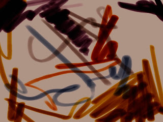
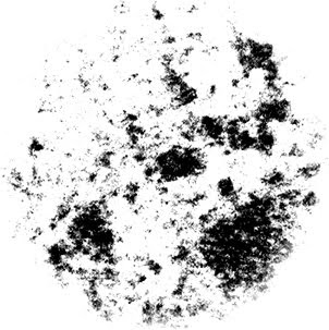
So, let's get to it! To make a custom brush, the first thing you want to do is find a brush with some qualities that you already like so you can start off in the right direction. I'm going to make an all-purpose painting brush, and I'm going to start with the Fine Point Marker 5 from the Felt Pens category. I chose this one because it is a slightly squashed shape which is more interesting than just a round brush, but what I particularly like about it is the way it blends color with the paint that's already on the canvas. The problem with it is that it only darkens what is beneath it, much like a real felt pen, but I want to make a paintbrush out of it that I can paint lights and darks with. Here's an example of what it looks like by default:


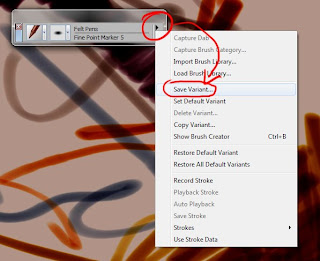
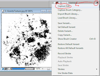
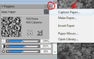
To get started, you'll want to make a copy of this brush so the original is still intact if you ever want it. Click the arrow at the top right of your brush selector and click Save Variant, then type in a name for your brush and click ok, it should show up in that brush category automatically


Variant is essentially another word for Brush in Painter, so you now have a base to build your brush off of. Now it's time to start editing, open your brush editor either by pressing Ctrl (Command) + B or by going to Window -> Show Brush Creator. The brush creator should open, don't worry if Painter seems to minimize, it's just some wonky interface code, which is most peoples' complaint with Painter. Save often and it won't be a problem. So, the brush creator, it probably looks really overwhelming and there are too many options to cover here; I'll go over some of the major ones, but my advice to you is experiment! Try making 10 custom brushes that look different and learn what the different settings do, with a little patience you'll become very comfortable in the brush editor. On the left is all your brush settings, and on the right is a little window for you to test your brush in.


A quick explanation of the options in the left image, as they'll be a good place to start:
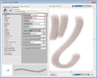
Dab Type: This is the shape of the brush tip. It is the "stamp" that the program repeats to make a stroke.
Stroke Type: This is how painter interprets the stamp, if it just puts one in front of the other, puts multiple ones next to each other, etc. This one is less important, but play with it to see if you can get something interesting.
Method: This is the big one! This is how the brush actually behaves, the way in which it lays down paint. You can see in the image above that this marker is set to Buildup, which means that it is building color on top of existing color which is why this brush can only darken. Play with the different methods to get the brush you want; I'm going to change mine to Cover because I simply want it to put down paint, covering the existing paint.
Subcategory: These are individual distinctions within each Method, you can use them to further customize the way your brush behaves. In mine, the Method is Cover and the subcategories are Flat Cover, Soft Cover, and various Grainy Covers. Flat is going to just be a plain brush, soft is going to have softer edges, and grainy is going to apply paper textures. Grainy is a powerful cover method, this is what you'll use if you want your brush to take advantage of the paper textures in the previous two segments! I want this particular brush to be simpler so I'm going to leave it on Flat Cover, but I have several brushes with grainy cover that are specifically for applying texture.
Source: This is what the brush paints. Don't worry about this, it only applies to certain brushes and you'll never really use it unless you want to stamp an image file. Again, experimenting is your best bet.

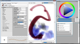
Next up I'm going to skip to the Well tab in my brush creator. This has to do with the consistency of the paint going down and how it reacts to other paint. Again, there are too many options to cover, so just play around with them and figure out what they do. Make a stroke in the brush tester, change the setting, make another stroke and see what's different about them. Now, the Well tab is interesting because most of its settings appear at the top of Painter even when you're not in the brush creator, allowing you to adjust these settings while working, which is very handy.


A quick overview of Well's settings:
Resaturation: Is how much new paint the brush will apply to the canvas. If the resaturation is high, it is like a brush dipped deeply in to a big blob of paint, it will totally cover anything already on the canvas. If the resaturation is low, it's like just picking up a few bits of paint on the end of your bristles, and it's going to mingle with the paint already on the canvas.
Expression: This appears under a lot of options in the brush creator. This is an important one, it is an option that allows you to vary that particular setting based on the input of your pen (assuming you have a tablet that can read those particular settings). If you change Resaturation's expression to Pressure then the resaturation will be higher the more pressure you apply. If you click the checkbox to the left of the expression, you will reverse the expression, so checking the box when set to pressure would make the resaturation higher the less pressure you apply. If that's confusing, again, experiment.
Bleed: This is how the color will bleed and blend with paint already on the canvas, and it ties in with resaturation. If you have a low resaturation and are not putting on new paint, then how does it react with the paint that's already there? Increasing the bleed will make the paint blend together more, both color and value. In my opinion this is Painter's most powerful feature, how it blends color, increasing the bleed is going to give you very lively transitions between colors, which is good if you're blending with it. I want this brush to be pretty blendy, so I'll increase the bleed and decrease the resaturation, it now behaves very much like wet in to wet oil paint.
Dryout: This is how fast the brush runs out of paint. If you use the Artists' Oils, you'll notice that you make a stroke and it fades out as you keep dragging it. If you decrease the dryout, the brush will run out of paint faster and will fade off. This can be nice if you only want to make short strokes with this brush.

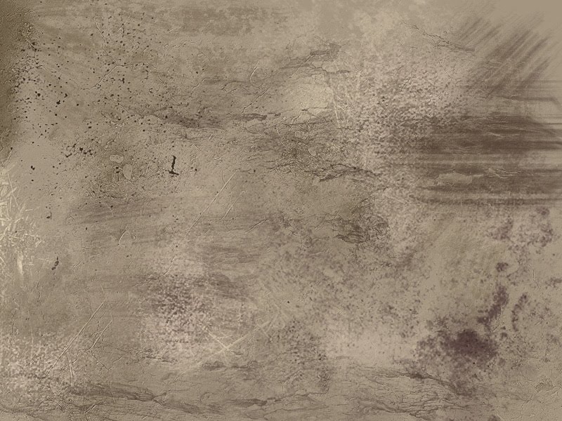
And that's going to be all I edit for this brush, all that's left is to close the brush creator and play around with it! Changing the Method to Cover, reducing the Resaturation and increasing the Bleed has turned a marker in to a nice, blendy paintbrush that you could use to paint an entire piece:


Now to finish it off, click the arrow in the brush selector where you saved the variant, and this time click Set Default Variant. This will make the current settings the brushes default settings, and if you click that same arrow and click Restore Default Variant it will return the brush to those settings. This is handy if you accidentally edit a default brush, you can then save a variant with the edited version, and restore the default brush to its default settings. Obviously, you can click Delete Variant to get rid of a brush you don't want any more.

And that's it for this segment! The next part will get more in-depth and show you some features where you can create really customized brushes outside of Painter's default options. But for now, play around with this and experiment until you're comfortable in the brush creator!
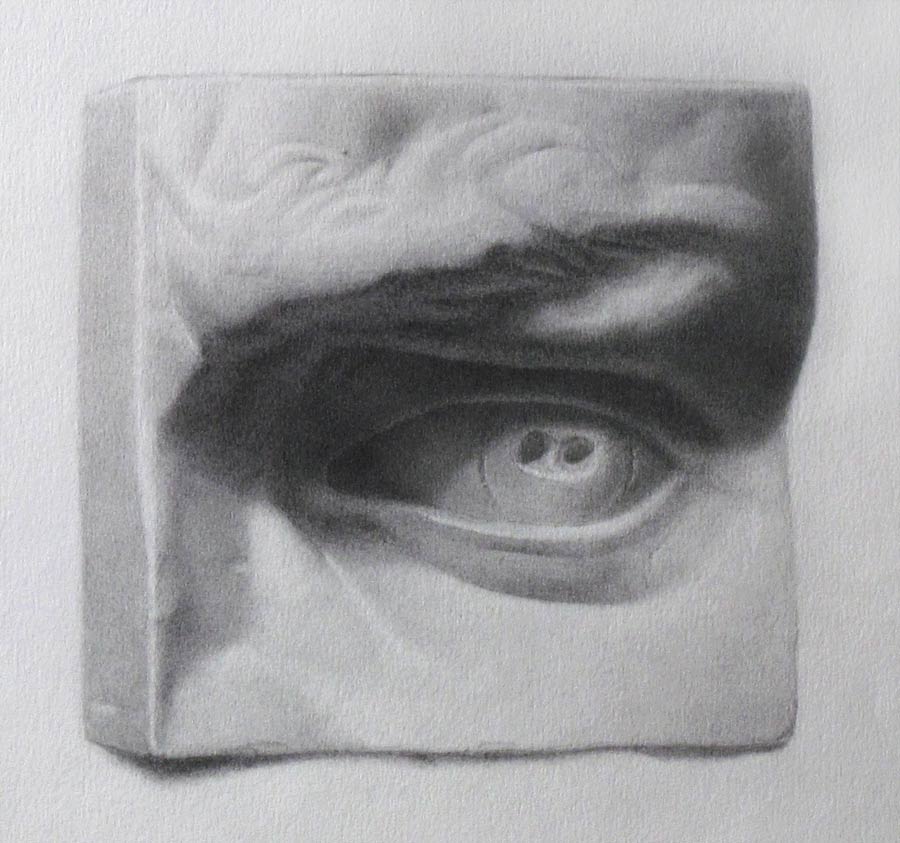
Thursday, February 24, 2011

Plein-air Sunset


Here's some artwork for today, a study from life in about an hour. Sorry I can't get the custom brushes tutorial up, but I've gotta be up at the crack of dawn tomorrow to do a sunrise version of this painting. We're currently studying time of day, and it's very interesting to work from life for this assignment cause there's so much subtlety that no camera could ever capture properly. It's gonna be a fun project to work on!

I'll try and have the custom brushes tutorial up either tomorrow or over the weekend. Have a good one!

Wednesday, February 23, 2011

Painter Paper Textures Pt. 2

In this section I'm gonna talk about creating custom paper textures in Painter. This is obviously useful in the sense that you can get exactly the texture you need in your piece, designing it to fit the way you intend to use it. You can then use painter's brushes to paint multiple custom textures over top of each other to create a huge variety of unique textures.

To start off with, you'll need some images to work from, so bust out your trusty camera and go texture hunting! You don't need a super expensive ultra high-res camera to get good textures, you just need something that can get an image about 1000 pixels wide with relatively little noise. When looking for things to photograph, the main thing is to obviously look for an interesting texture, but more specifically look for things with a good amount of contrast between the lights and darks, have some amount of repetition, and would be fairly easy to tile (that is, make the edges blend seamlessly in to each other). Also try to take your photographs from as straight-on as possible so your texture doesn't have perspective, or it might look wonky in your piece.

If you don't have any kind of camera, you can still get textures online and use them; this will work just as well, but they may require credit to use. The disadvantage of getting textures online is you'll probably only search for things you expect to use, going on a little texture-hunt with your camera will show you lots of interesting possibilities that you wouldn't have thought of that will ultimately add more fuel to your creative fire.

Here's an example of a texture I shot, the image is straight out of the camera. It's a little low contrast, but that will be edited later. The important thing is that it has an interesting balance of light & dark shapes that will make for an interesting texture. Try and get at least 10 different textures with a good amount of variety.

Now we've got to turn it in to something you can use. It's best to not use an image straight out of the camera, so let's start with some editing. This is where Photoshop will have an advantage over Painter. If you have Photoshop (Elements will do), you will want to start by tiling your texture, check out this tutorial for info on how that's done: [Link].
You will then want to turn your texture black and white, then increase its contrast so that it has a clear division between lights, midtones, and darks. In Photoshop, you can do this with Image-> Adjustments-> Hue/Saturation, and Levels (Ctrl+L). In painter, you can use Effects-> Tonal Control-> Adjust Colors and Effects-> Tonal Control-> Brightness/Contrast. I can explain that more thoroughly another time, but it should be simple enough that you can figure it out.

After editing, your texture should look something like this, so just resize it to something around 1,000 or 1,200 pixels and save it to your textures folder!

Now to get it so we can use it in Painter is relatively simple. Simply open your Papers palette (Window-> Library Palettes-> Papers). Now open up your texture and press Ctrl+A to select the entire image. Then click the arrow in the top right corner of your Papers palette, then click Capture Paper. Now just type in a name for your paper and click ok!


The paper should then appear in your Papers palette, and you can use the options shown in Part One to edit your texture while working and get all kinds of variety. So just create a nice library of different textures, grab your Large Chalk brush (Or whatever textury brush has captured your imagination) and start painting!

Below is an example of my paper library put in to action. Compare it to the final texture image in part one and you'll see why you want to make your own paper textures!


And that's it! Tomorrow will be covering how to make some custom brushes that will really take advantage of these textures. Happy painting!

Painter Paper Textures Pt. 1

Here's part one of five in a series of getting natural looking brushwork using Corel Painter. Though a lot of these rely on tools that are exclusive to Painter, the same concepts can be applied to Photoshop if you do a little research and experimenting.

The first thing we'll cover is Paper textures. This is one of the features that really makes Painter shine, as it's a very dynamic and versatile way to add texture to something. It's strength lies in the fact that the paper texture is universal; unlike Photoshop where you will need to enable texture on brushes you want to use and then select the texture, paper textures in Painter will apply to all brushes that are set to one of the Grainy Cover modes, which I will explain more in-depth later on. The advantage of this is that you only need one type of texture brush and you can apply all kinds of different textures to it that you can edit on the fly, reducing the number of tools you need and saving time switching between different textures.
To start, click on Window -> Library Palettes -> Papers to open the Papers window. It should look something like this:

Using the options in the diagram above, you can edit your texture to get more variety and interest.

Paper Name - The name of the paper currently selected
Paper Selector - Click here to select different papers
Paper Preview - An image showing what the current paper looks like
Directional Grain - Changes how the paper reacts based on direction
Invert - Reverses the values of the texture, making white black and black white
Paper Scale - The size of the paper texture
Paper Contrast - How far apart the lightest and darkest values of the texture are

The important thing to remember with textures is this: The black parts of the texture will be painted with full opacity (or at the highest opacity of your brush), grays will paint at a medium opacity, and whites will not be painted at all. With this in mind, it's easy to get a variety of textures. Need an area to have more focused areas of texture that's not as thick? Just increase the brightness and contrast so there's less black and more white, therefore less texture and more empty space. Need to paint some additional texture without painting over the texture that's already there? Increase the scale of the texture so it's painting over a different set of pixels and will leave existing texture intact. Want to paint some more 3D looking texture? Paint in your darks, then Invert it and paint your lights on top. Experiment with these options to figure out how you can use them in your work.

Now you have a texture, but how do you use it? This will require some experimentation, a number of Painter's brushes will apply paper textures to them and will be useful for painting. I would recommend starting with the Large Chalk brush in the Chalk category. Using just the Large Chalk and Painter's default papers, you can get a whole variety of texture that will be useful for all kinds of things:


The textures above, though in need of more adjustment and subtlety, are reminiscent of traditional underpaintings This would be a great way to fill in a background with a nice textured tone and then paint your piece over top of it, leaving some showing through for interest. It's also handy simply for texturing; you could easily add some texture to a stone wall to make it pop and feel more real.

I'll cover making your own custom papers as well, but this is getting a little long already so that will be posted tomorrow, followed by how to make custom brushes that will really take advantage of these textures.

Hope you found this helpful! Have a good one!


Monday, February 21, 2011

Cornwell and Painter tips


Here's a master copy of a piece by the great Dean Cornwell, done for an assignment in Painting class!
The primary purpose of this was to get the feel and impression of traditional brush marks using a digital tool, and though I'm still no Cornwell I think it turned out quite successfully!

So on that particular topic, this would seem to be a good time to kick off the little mini-tutorials I'm gonna include on this blog. Over the next 5 days, I'm gonna be posting some techniques to help you get more natural looking brushwork in your digital work. Hard-rounds are great and a lot can be done with them, but a good variety of marks and brush strokes is one of the most interesting things about artwork in my opinion, so a lot of the time a hard-round just doesn't cut it.

This series will be geared towards Corel Painter, but most of the concepts can be applied to Photoshop if you know your way around its brush editor. The topics covered will be:
1. Painter Paper Textures Pt. 1
2. Painter Paper Textures Pt. 2
3. Making custom brushes in Painter Pt. 1
4. Making custom brushes in Painter Pt. 2
5. Using Painter's Impasto feature

Click on the detail shots below to get an idea of the textures you'll learn to make.

Sunday, February 20, 2011

Pick-out portrait


Here's another oil portrait for head painting class; this will be our last one using the pick-out technique, which is using only burnt umber (or an equivalent dark paint) and then using thinner (ideally gamsol) with brushes, rags, and cotton swabs to pick out your lights. It's a really powerful and fast way to work in oil, if you're doing a sketch or an underpainting I would definitely recommend it. It's also an excellent way to get a feel for different brush strokes, get used to the feel of oil paint. You'll also push your understanding of values since there's no color to be concerned with.

If you want to give this technique a try, definitely try to focus on how wet (saturated with thinner or paint) both your brush and your canvas is. Through a little practice, you'll be able to use the wetness or dryness of both to control your edges; wet brush on wet paint will push things around really harsly and create hard edges. Gently sweeping across a dry canvas with a dry brush will soften edges, slightly lighten your darks and darken your lights, letting you smooth out harsh strokes and emphasize the larger forms in your piece. In the portrait above, I ended up focusing way too much on the smaller forms of the face, the nose and wrinkles and such, so it ended up looking very flat; then to save it I did just a bit of dry brushing to re-establish the big egg-like form of the head, which subordinated all the smaller forms and made it much more structurally sound.


Saturday, February 19, 2011

Updating daily!


Last post in June, eh? Well that's no good! It's time to get these socks-a-rockin, so starting today this blog and my CA sketchbook will be updated daily! I'll be posting finished work, WIP, sketches, and studies from TAD. I also want to include content other than my own art, so every now and then there will be mini-tutorials, tips, inspiration from artists who actually know what they're doing, and whatever else manages to find its way in here!

SO, between the last update and now I went through my first semester at TAD. It was quite possibly the best thing ever, so much good info was thrown at us about every art-related topic you could imagine, everyone improved exponentially in just 6 months. We've now begun our second semester and things are looking just as good and better. I'll be posting a lot of my studies here, and talk about some of the things I'm learning as well.

But enough yammering, here's some of the highlights of the work I did for TAD and a few personal works, click any of the images to view them larger.
Hope ya dig, enjoy your weekend, and seeya tomorrow!


Above, TAD poster assignment for Composition 1 class.

Oil pick-out painting for Head Painting class.


Abstract composition studies from masters for Composition 2.


Ideal studio drawing for Linear Perspective.

Cast drawing for Light & Form.

Prud'hon master copy for Light & Form.

Figure drawings for Figure 1.


Franklin Booth master copy for Media 1.

Nicolai Fechin master copy for Media 1.

Still life study, personal work.

Born of Passion, personal work.